Thursday, 11 August 2011

MY final poster....

FINAL POSTE

 This is my final poster. I have created a natural, symmetrical and soft design by curling, scoring, folding and attaching paper and I'm really happy with the outcome. although if i had more time i would have used some different lighting maybe just to produce a better quality photograph. but all this poster is a photograph and i have not added anything using photoshop in order to keep the naturalness of paper and to show ugh pieces of software are not needed to produce beautiful natural designs using only paper.


Final poster designs....


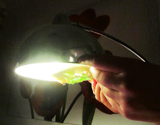
i decided to use the lamp in my house as my light source as its not too bright and is really
 soft and natural looking.


in the design below i have stuck to the symmetrical theme i have been wanting to achieve.
 I have also only used paper so it has the natural look i wanted. i have placed the paper sculpture and all the text on a plain piece of a2 paper and photographed it from above.


This design isn't as symmetric but i have made the sculpture frame
the poster as well as the long strips of paper used to frame it.


these are some other layout ideas i had....


The text....

Below i have created a type using strips of photo paper as this seems to be the strongest. 
i curled the strips and attached them by cutting a slit in one side and pushing the other through the slit. this is a neat way to create the type and its also easy to undo unlike glue.


The font looks really fluent and soft, much like my sculpture. this is a recurring theme 
that i have been trying to create in my poster.


Here i tried to see what the text would look like on a white background
and luckily the shadows create some great contrasts. 


Existing Posters research..

All the posters below are pretty symmetrical and all the posters below are really famous too.
the focus i mainly right in the middle of the page. This is what i would really like to do in my poster in order to get it to catch peoples attention.


Final designs....


In order to make my designs a little more interesting i decided to add previous
ideas to my final designs. my sketches below show how the flowery 
piece will be placed upon the large flower like sculpture. 
hopefully this will add detail to my poster. 


I then cut out the curled flower pieces and applied them to my sculpture.


More floral paper sculpting....


after creating the flowery looking paper sculptures i decided to use the same technique again, but this time i have used a more natural stock of paper (the colour of leaves and stems). 


These macro shots are really nice as the finer details are seen like the curls 
in the paper form and the beautiful textures.


Below i have used daylight as my light source which is colder but more detail
can be seen.


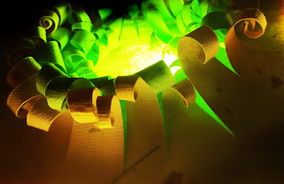
Here i used a lamp and put my sculpture right next to the blurb which has given the piece
a glowing effect. The light is tinted with green and hits the other parts of the sculpture. 
This is really effective.


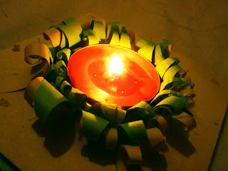
I got a little exited experimenting with light sources and placed a candle inside my
 paper which gave me some really interesting photos. The candle light is natural
 andglows beautifully upon the paper.


Flowery things....


Jenny starks work...

Jenny starks designs are really colourful and the amount of layers of paper she uses creates these stunningly complex designs. i love the way her designs are much like flowers. Also the use of vibrant colour looks really interesting to work with.


Some primary research of flowers...

I went into the garden and took some shots of flowers. the layers of petals 
and vibrant colours give me some really great ideas.


My  sculptures.......


The contrast between the bland white paper and the vibrant colour is 
extremely interesting and stands out a lot.


Adding more sheets of paper meant more layers as seen below in my 
other sculptures. i really like how thick the paper sculpture has become.


These last two photos of my sculpture ads my favourites as they're 
simple but really effective
.